🤖 How to use AI with your Apple health data to get personal insights
One of the most exciting updates for ChatGPT just dropped - "Advanced Data Analysis" (since publishing this is now integrated into GPT-4). This means you can now use ChatGPT to get insights about your health, like the graph below showing my daily steps data as a graph:
What is "Advanced Data Analysis"?
Quick answer: ChatGPT with Advanced Data Analysis (ADA) allows you to upload data to easily and quickly extract advanced insights and visualization for this data. Detailed answer: ChatGPT with Advanced Data Analysis is a feature of OpenAI's ChatGPT that enables ChatGPT to understand and execute Python code. This allows it to perform computations, manipulate data, create visualizations, and more, all within the context of the ongoing conversation. You can access this feature by simply clicking the dropdown on ChatGPT Plus accounts where it says GPT-4 and then select the tool (see the screenshot above).
An example of how you can use this tool for insights
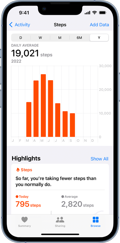
I recently became one of those people who regularly check their Apple health data to monitor my daily steps. However, Apple Health isn't great at showing interesting insights or statistics for your health data. All you can really see is this: Daily average steps and average steps by week month and year.
ChatGPT with ADA (GPT-4) can give you deep insights on your health using Apple's health data...
For example:
If you export your Apple health data and then upload these into ChatGPT with DA enabled, along with a simple prompt like below, you can get many more insights...

What happens next:
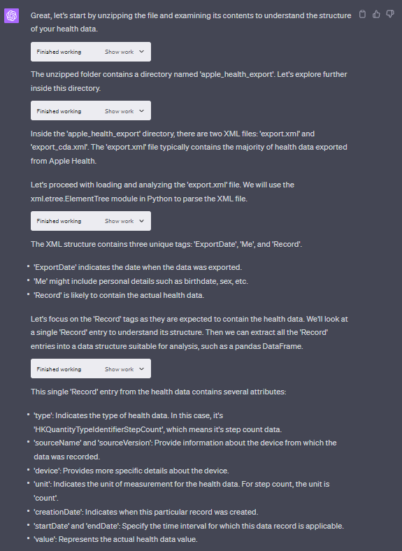
ChatGPT will unzip the data & start studying the file. Here, you can see how and what data it is looking at to ensure it's making the correct assumptions on your data.
After this process is done ChatGPT will give you insights in text form, then it will give you graphical charts, tables and more. See examples below...
Using just my Apple Health data I got these graphs:
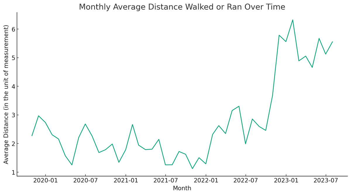
From the graph above you can see I never left the house until I got my dog in Oct 2022.
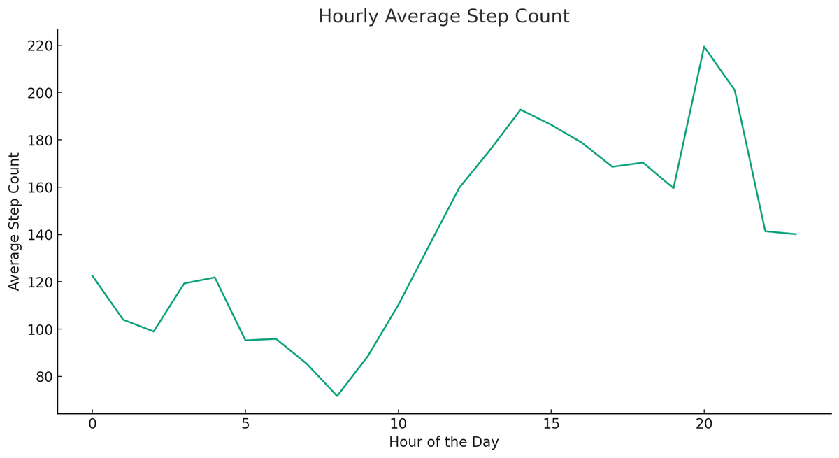
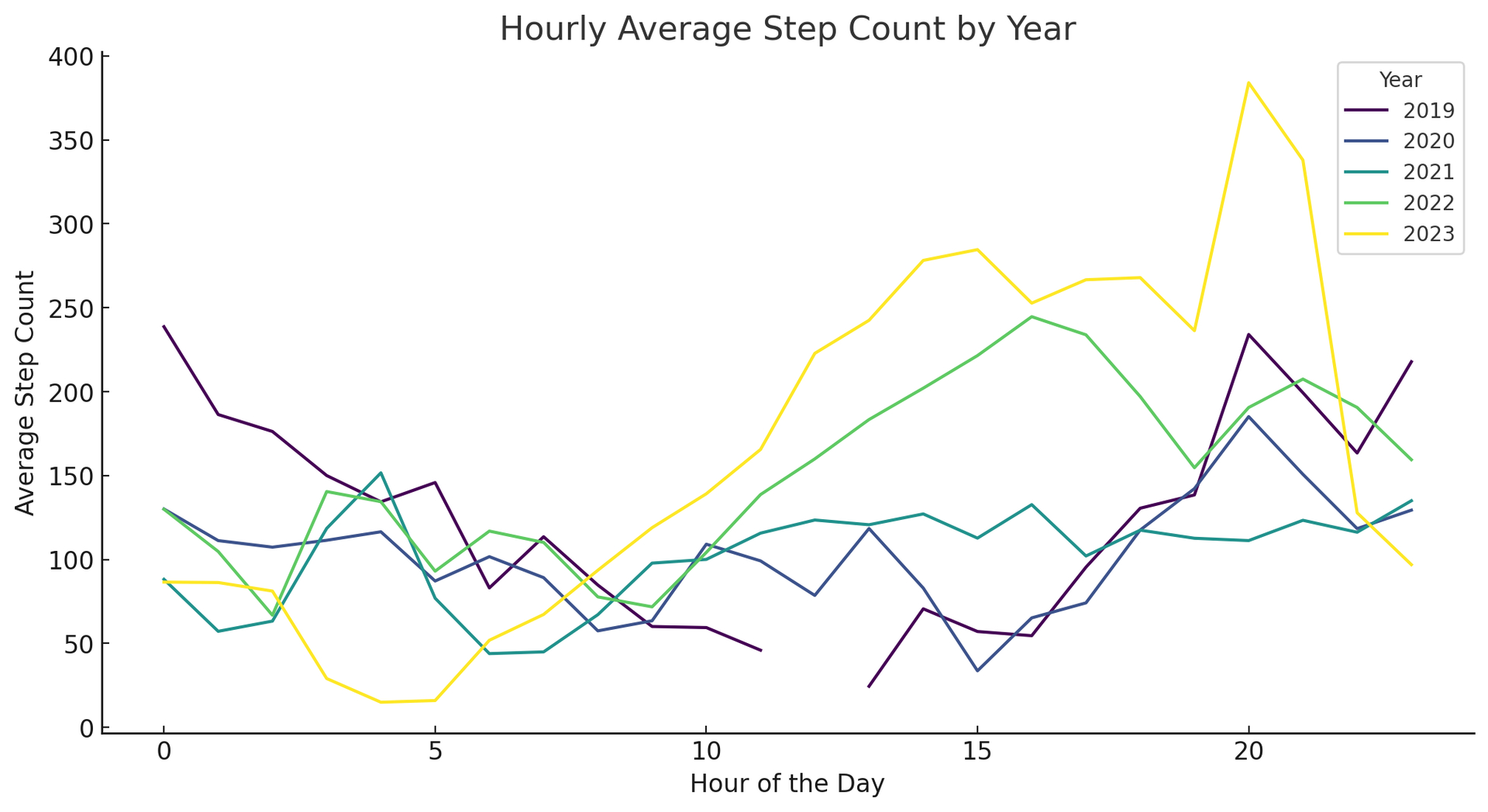
The graph above shows what times on avg I take the most steps in the day.
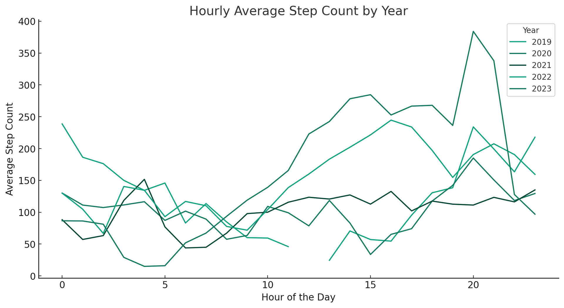
The graph above shows how many steps per day I took on average per year.
However, that last graph is a little hard to read as all the lines are similar colors. So, to fix this I asked ChatGPT to change the colors with this prompt...

Within a minute it gave this revised graph: